Filmo

Filmo

Where the magic of cinema comes alive on every page.

Where the magic of cinema comes alive on every page.

Roles

Concept
Branding
Publication
Layout
Social

Description

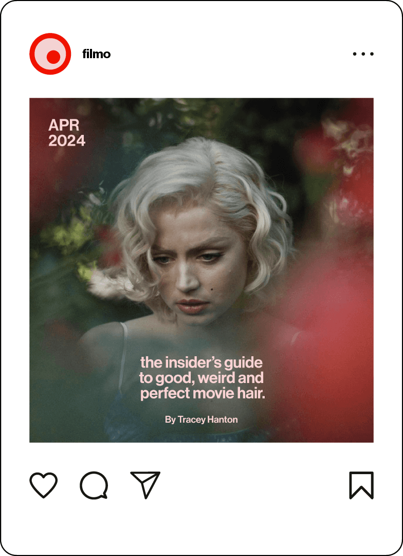
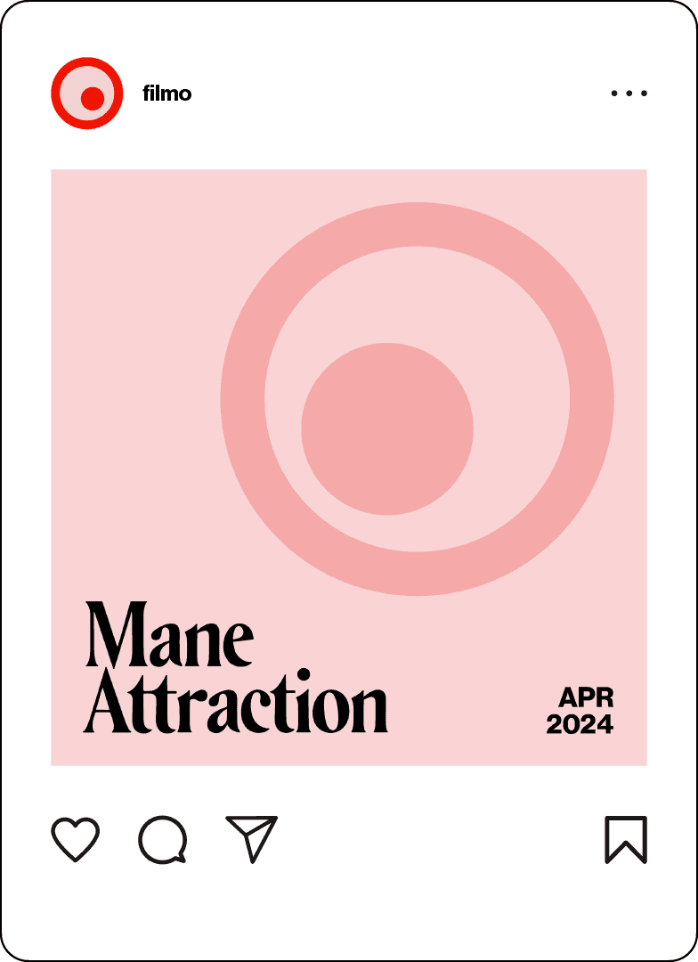
Filmo is a magazine that aims to bring readers a curated selection of content that reflects the diverse landscape of cinema. From exclusive interviews with industry professionals to the latest news, Filmo's pages are dedicated to celebrating the artistry that defines the seventh art.
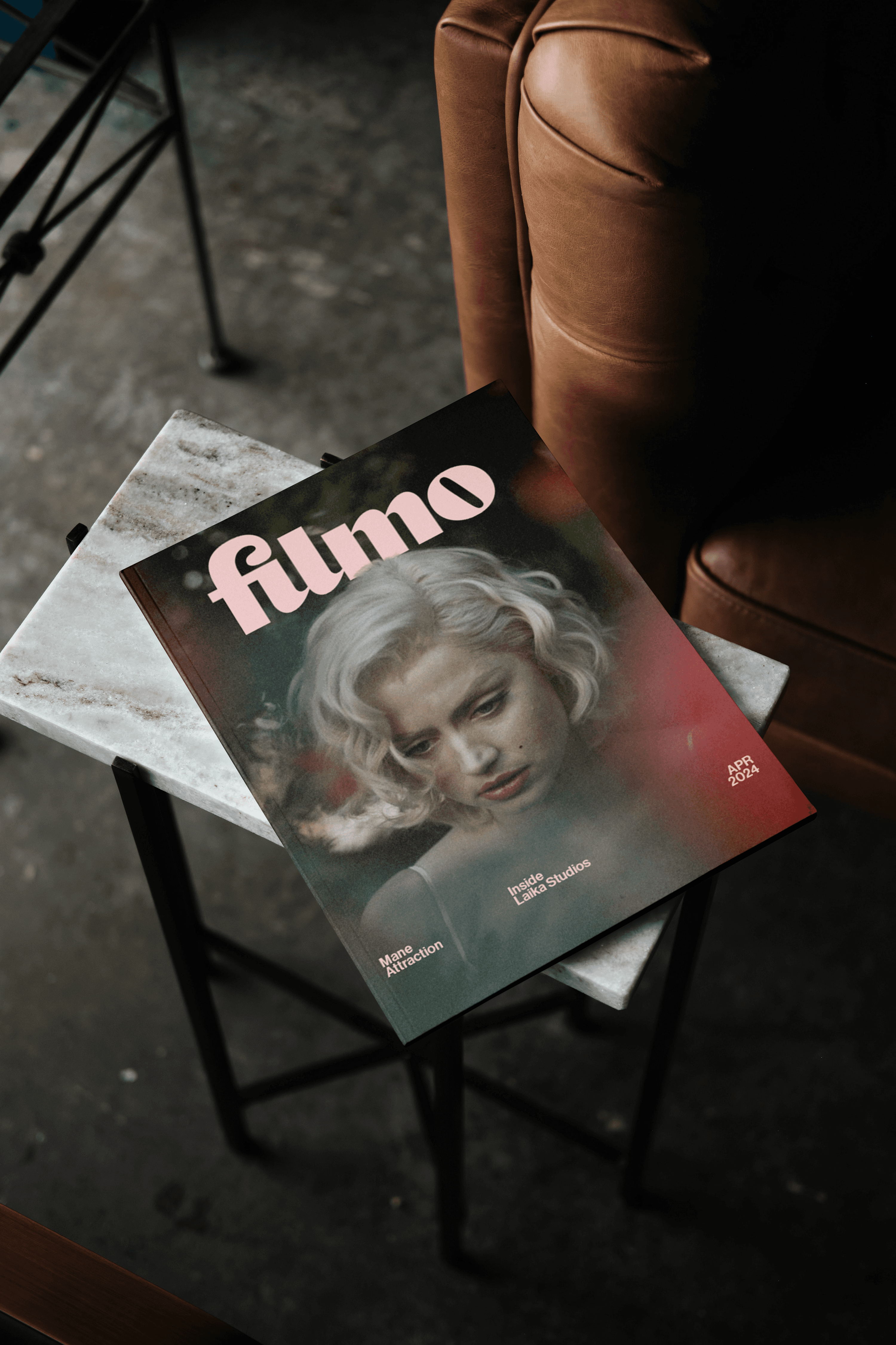
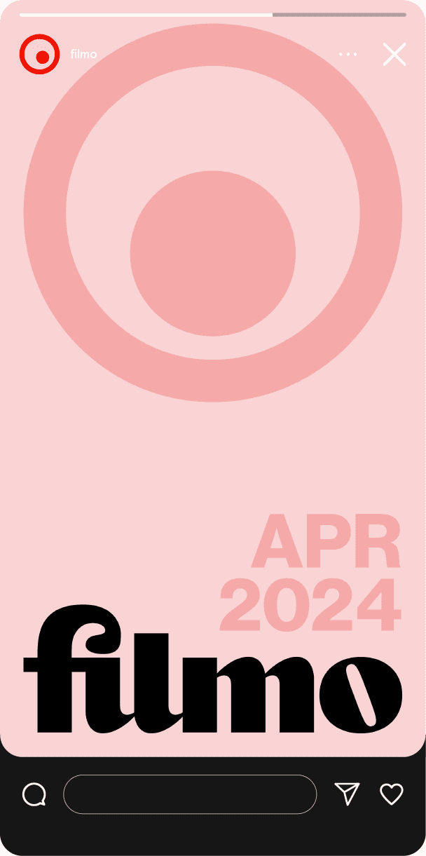
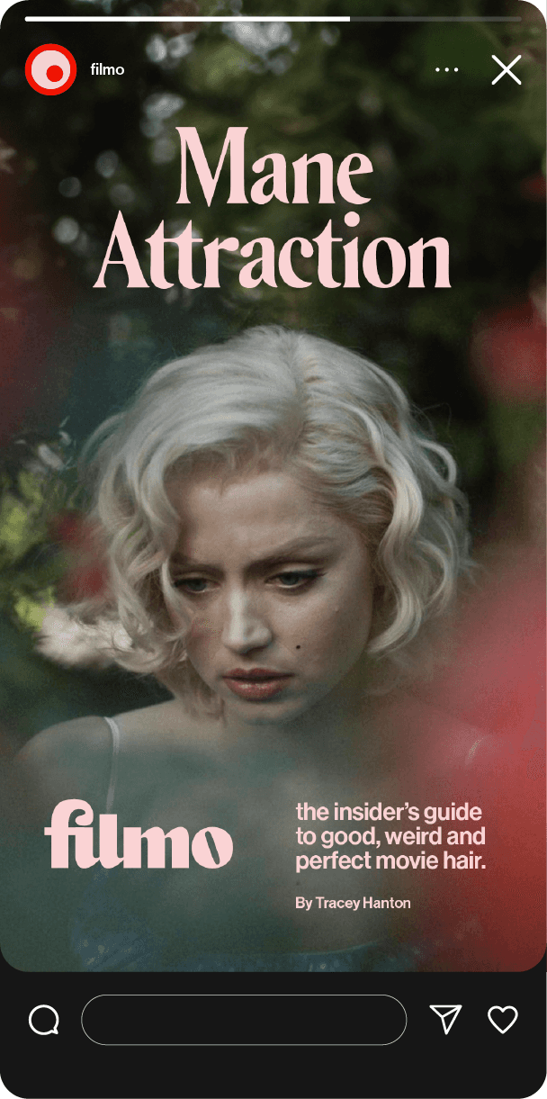
"Filmo’s visual system adapts to its content while maintaining a strong independent identity."

"Filmo’s visual system adapts to its content while maintaining a strong independent identity."

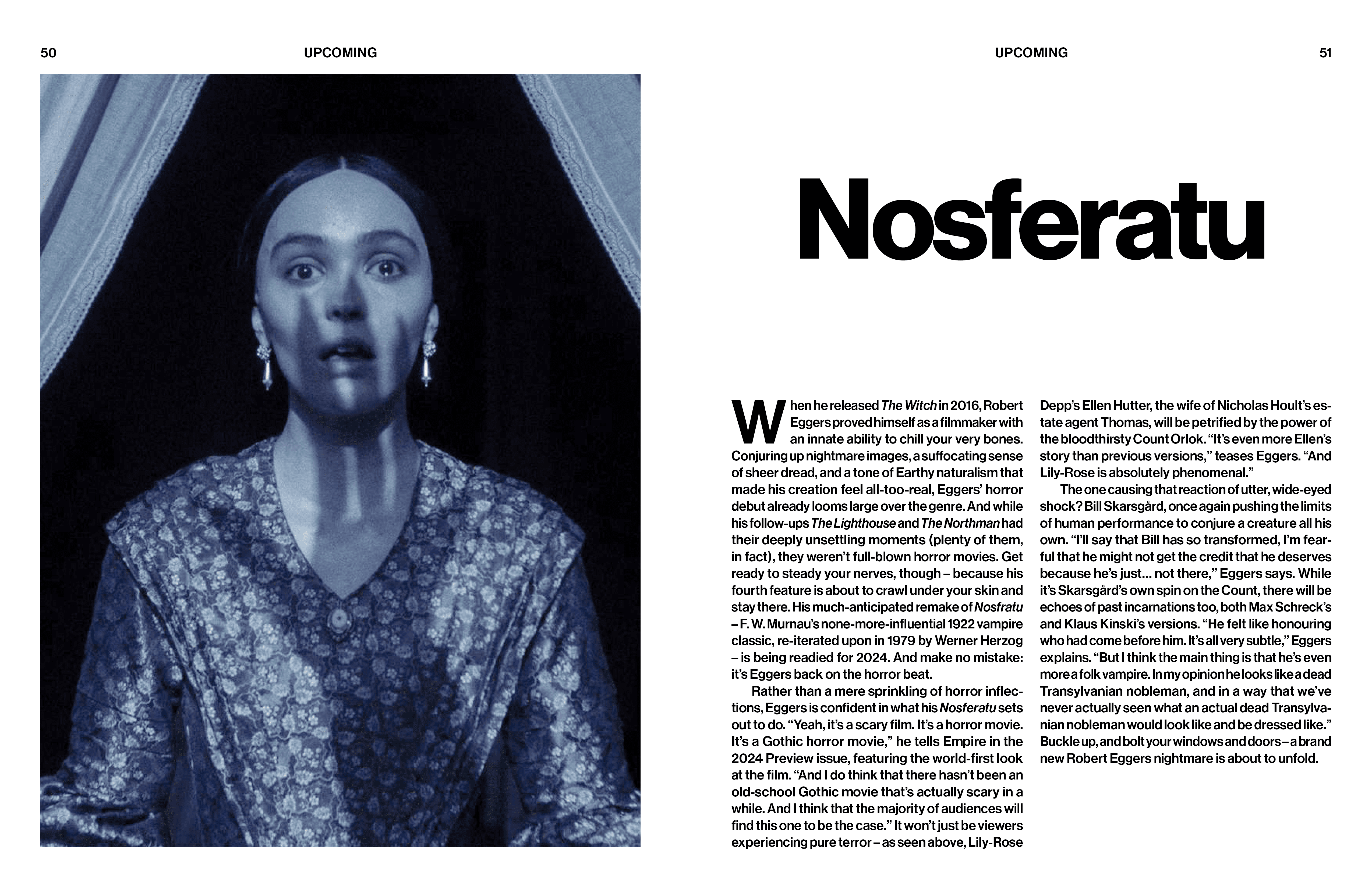
"Each page is designed to immerse the reader in the film’s narrative world."

"Each page is designed to immerse the reader in the film’s narrative world."

Process

Process

Process

Trace Filmo’s creative journey, from early research and brainstorming to its final execution.

Trace Filmo’s creative journey, from early research and brainstorming to its final execution.

Concept

Concept

Concept

Filmo is magazine that aims to bring readers a curated selection of content that reflects the diverse landscape of cinema. From exclusive interviews with industry professionals to the latest news, Filmo's pages are dedicated to celebrating the artistry that defines the seventh art.
Ideation

Ideation

Ideation

Due to limited initial reference points, defining a clear focus for the magazine and envisioning the project as a whole proved challenging at first. An early visit to the library helped establish direction, where a range of publications were collected for analysis and reference. Many of these shared common design strategies, including grid-based layouts, expressive font pairings, and generous use of imagery and color.

Film was selected as the central subject of the publication, serving as both the thematic and conceptual foundation of the project. From that point forward, the primary challenge became developing a brand from the ground up that could present the topic in an engaging way while remaining distinct from existing film magazines.

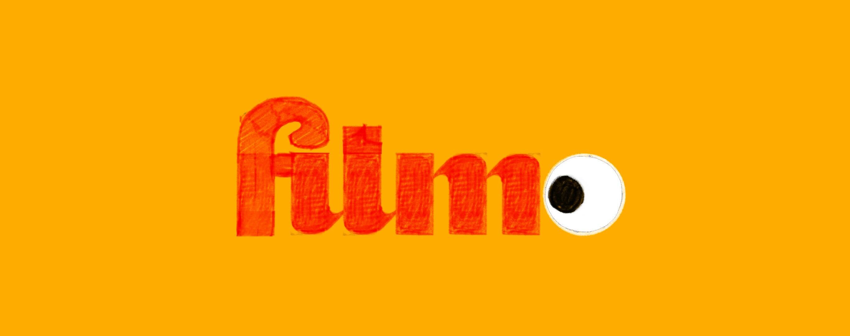
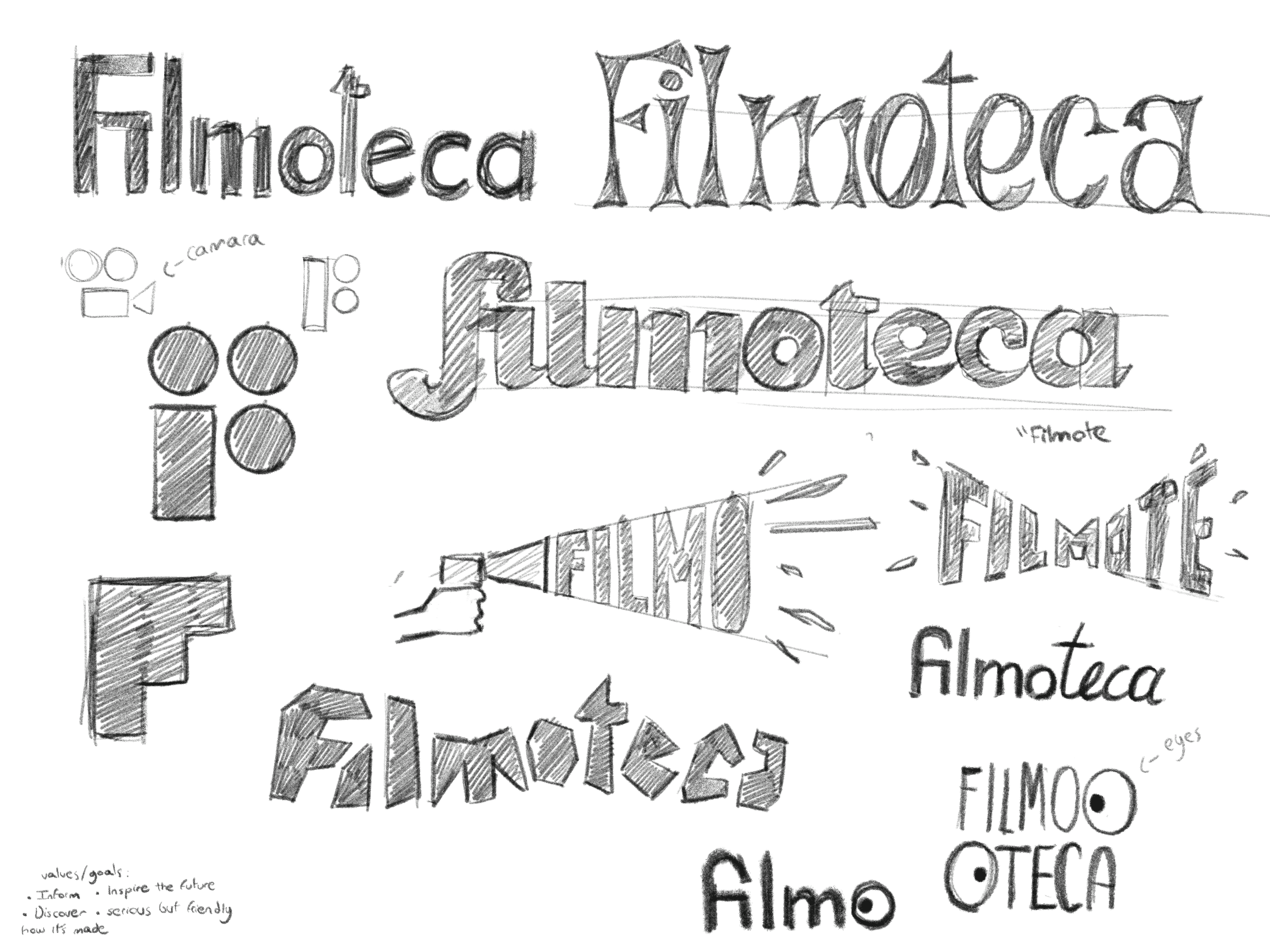
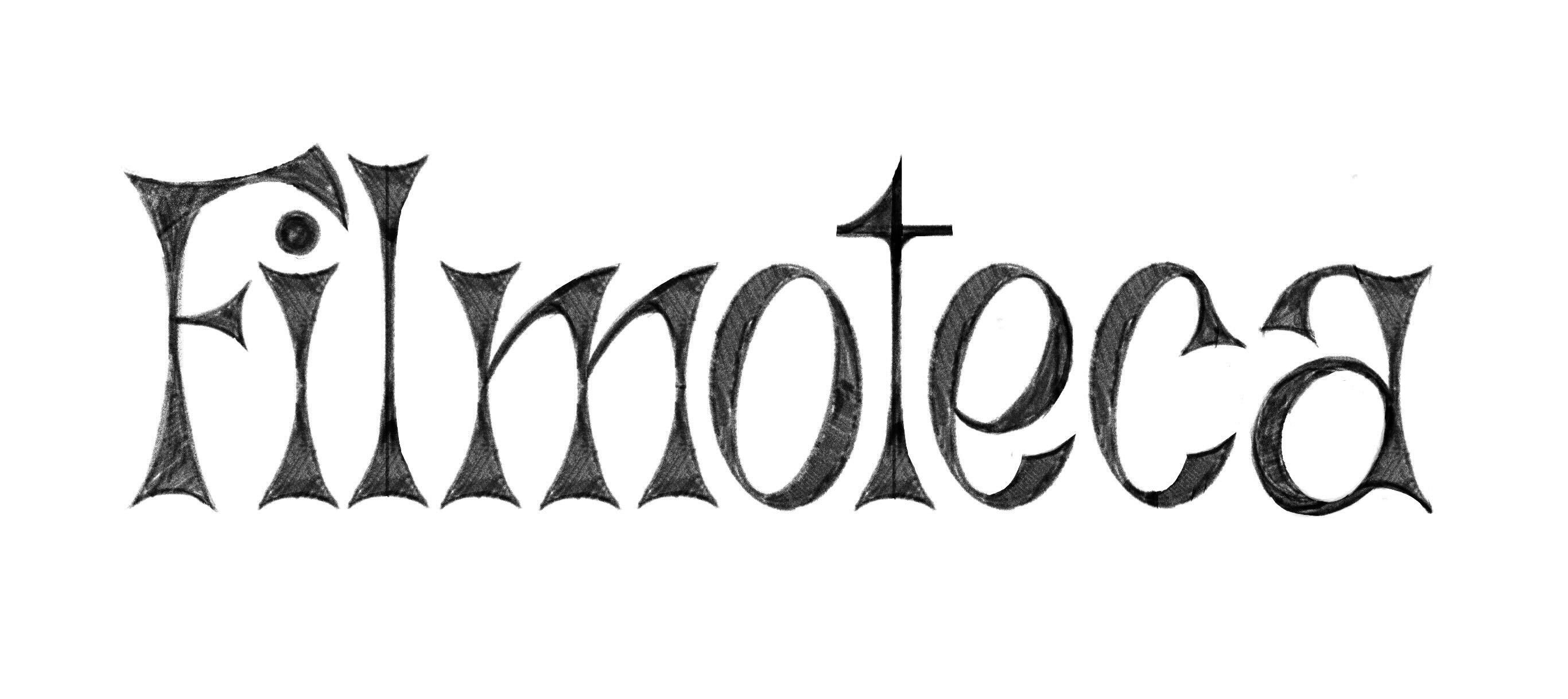
The name Filmo emerged from a play on the word “Filmoteca,” the Spanish term for a film library. Its central visual element, the eye isotype, draws from the act of watching films and the shared experience of spectatorship. A flexible visual system was developed to integrate the eye across all brand elements, including the publication itself and its marketing materials. The eye is often positioned as if observing or directing attention toward content, such as body text, headlines, or imagery. The logotype was designed using a custom typeface characterized by its heavy letterforms, resulting in a bold, playful presence that remains adaptable across different contexts.
Logo Mark

Logo Mark

Logo Mark

Built from scratch, the typography for the Lemy logo is a custom sans-serif with subtle additions that evoke calligraphic lettering (a quiet nod to the past while maintaining a contemporary feel). The goal was to reflect how myths and legends travel through time. Though rooted in ancient origins, they continue to evolve with each retelling.

Category System

Category System

Category System

Based on the established mythology category system, nine icons were designed to represent each category. All icons were constructed using the same square grid to ensure visual cohesion across the set. The system was developed to allow each icon to scale to different sizes without losing clarity, while clearly communicating its category without relying on text.

While it is still unclear how effective the system will be in practice, the goal with the current nine categories was to cover as many types of myths from around the world as possible. There is always room to expand, and new categories can be added over time to better reflect the kinds of stories people continue to share.

Color System

Color System

Color System

The addition of color plays an essential role within the system. Rather than functioning solely as an accent for the icons, it connects each myth to its place of origin. Each color palette represents a different region of the world, adding a layer of geographic context. When combined with the iconography, this creates a system in which myths are recognized not only by type, but also by their geographic origins.

The system does not rely on the audience immediately associating specific colors with particular regions. Instead, repeated exposure and contextual placement gradually familiarize users with the logic of the system. For example, encountering different color palettes while traveling abroad, as opposed to those seen in one’s home region, reinforces these associations over time. Through this process, legends become more easily connected to their geographic origins.

Typography

Typography

Typography

Following the same idea behind the logo, the chosen typefaces for Lemy include both a serif and a sans-serif. Argent CF Light and Light Italic serve as the serif styles, bringing a touch of elegance and historical reference. For the sans-serif, Neue Haas Grotesk Display Pro 65 Medium was selected to maintain a clean, modern tone that complements the brand’s contemporary feel.

Usage

Usage

Usage

Once the system was finalized, a range of assets was developed to express Lemy’s core mission: bringing myths to the palm of your hand. The poster shown below, presents a local myth from Guanarito, Venezuela. It is designed for display in spaces such as metro stations, subways, or other areas where passersby might pause—even briefly—and feel encouraged to engage with their surroundings. The poster also demonstrates how the visual system functions when applied in a real-world context.

Why wouldn't I just hire a full-time designer?

Is there a limit to how many requests I can have?

How fast will I receive my designs?

What type of work do you make?

What if I don't like the design?

Are there any refunds if I don't like the service?